Difficult to navigate between pages of a review

Snowy

Slightly less n00b
Joined
Jul 6, 2019
Messages
98
Points
18
Hi,
I find it very difficult to quickly navigate to a specific page in the review. The only options appears to be:
1630028646655.png

I skimmed the review, then read something in the concolusion, and now I want to read more detail... The only problem, I have no idea what page it's on! And just having the pages numbers don't help me at all. I'm very likely to just exit the review and not go back if I have to potentially go through 7 pages to find what I'm looking for.
Can you add a drop down to navigate between pages with the page titles? I thought this existed on mobile, but I can't seem to find on desktop.

Thanks
 
Hi,
I find it very difficult to quickly navigate to a specific page in the review. The only options appears to be:
View attachment 1223

I skimmed the review, then read something in the concolusion, and now I want to read more detail... The only problem, I have no idea what page it's on! And just having the pages numbers don't help me at all. I'm very likely to just exit the review and not go back if I have to potentially go through 7 pages to find what I'm looking for.
Can you add a drop down to navigate between pages with the page titles? I thought this existed on mobile, but I can't seem to find on desktop.

Thanks
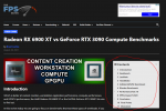
Have you tried the table of contents?

1630077061255.png
 
Have you tried the table of contents?

View attachment 1224
Thanks... Didn't notice it there... Typically, the right side of content is reserved for ads, and given it's open block design, I probably just assumed it was an ad. I would recommend placing it at the bottom, next to the page counter.. seems to be more standard design that way. Don't know if you have a service like https://www.crazyegg.com/ that allows you to view heatmaps, but I would imagine most other users aren't looking for the Table of Contents there, either.
 
Made some changes to where the table of contents displays. Let me know your thoughts.
I will check on desktop later today and let you know. On Mobile, the “hamburger” icon in the upper right disappears before you get to the end of the article (page numbers). If possible that should also display through the whole page.
 
I will check on desktop later today and let you know. On Mobile, the “hamburger” icon in the upper right disappears before you get to the end of the article (page numbers). If possible that should also display through the whole page.

That could be a limitation with the plugin - it seems that it shows it as long as you're within the "WP Content" div of the page, but once you hit the footer nonsense it bails. I haven't seen a setting to make it stick the rest of the way, but I'll dig in the code to see if I can make a modification. You'll see the same behavior on the desktop.
 
@Snowy New theme update that arrived over the weekend added Previous/Next page selectors next to the numbers.
 
Become a Patron!
Back
Top