Mozilla Rolls Out Firefox 89 with Redesigned Proton UI

Tsing

The FPS Review
Staff member
Joined
May 6, 2019
Messages
12,595
Points
113
firefox-89-proton-ui-redesign-youtube-anime-1024x577.jpg
Image: Mozilla


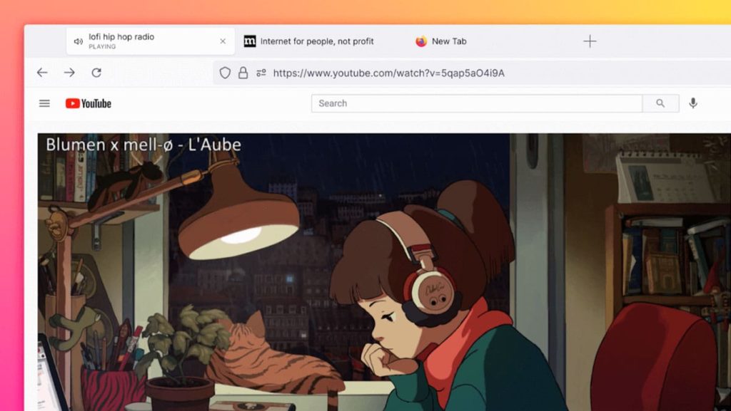
Mozilla’s design team has been working hard over the last months on a fresh new user interface for its popular Firefox browser. That effort debuts today as part of Firefox 89’s redesigned Proton UI, which features a sleek new look, simplified toolbar, streamlined menus, floating tabs, and more. Firefox 89 also features a number of usability and security improvements such as expanded privacy protections and a stronger private browsing mode with more aggressive cookie management. The full changelog can be found here.


Based on our research, we found out that more than half of you have 4+ tabs open all the time, and some of you have more, a lot more. And we feel that! Tab as much as you like, friends. Tabs got a makeover so they are now gently curved and float...

Continue reading...


Uh, four?

My default set of tabs is like 25...

And this UI update is certainly as 'flat' as they claim:

1622600395594.png
 
The update didn't f*ck with my theme or custom setup, so there's that at least. Although the new floating tabs look weird.
 
Last edited:
Can’t wait to hear the complaints from family about this. They’ll think someone hacked their systems and changed their settings, lol.
 
"Simplified" "Sleek"
Not words I want to hear when it comes to software. As they usually translate like this:

Simplified = What you could do with one or two clicks previously now takes you 30 seconds of wading through subsections of hidden away menus
Sleek = the UI literally has no design now, and every button takes 4 times the space on your screen for no reason.
 
It just updated for me, as expected worse in every possible way.
Here is the list of things I take issue with:
  1. Ignores system color scheme
  2. Why the hell is the background of the address bar textbox grey instead of white?
  3. While the rest of the address bar is white?!
  4. Tab titles detached from the actual tabs, just hovering above them
  5. Context menus are custom now, not regular panels, and have a weird smoothed animation to them
It's only saving grace that it can be disabled in about:config
 
Become a Patron!
Back
Top