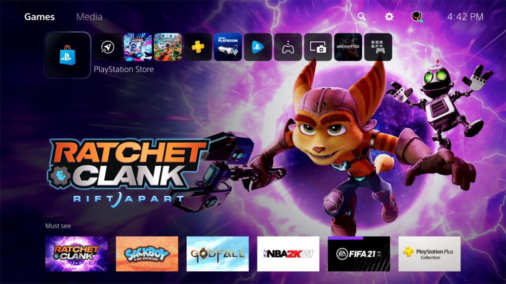
Sony Unveils PlayStation 5’s Next-Generation 4K UI

Tsing

The FPS Review
Staff member
Joined
May 6, 2019
Messages
12,595
Points
113
playstation-5-ui-ratchet-and-clank-rift-apart-1024x576.jpg
Image: Sony


Sony has finally shared a look at one of the last and most important pieces of the PlayStation 5 puzzle: its user interface. In a new video, Platform Planning & Management lead Hideaki Nishino gives us our first official look at the PS5’s UI, which was designed from the ground up for 4K displays. The UI switches out the barren blue that dominates Sony’s previous menus with a glimmery aesthetic, hearkening back to the PS3 generation. Icons and content thumbnails have also been updated with a sleek, rounded look for a cleaner feel.


A good portion of the video is spent showcasing how the UI functions during a game. Sid...

Continue reading...


Looks good, I've always been a fan of Sony's UI since the PS3 (which is probably still my fave).

I find the Xbox interface a bit... 'busy'. I've gotten used to it, and can find my way around easily enough now but do prefer the simplicity of Sony's.
 
XMB on the PSP and especially PS3 has been my favorite of all the console UIs. Never cared for any of the variations of the XB1 one. I hated all the X360 UIs except the very first one. PS4 one not bad, it gets the job done. Switch UI is pretty nice too, if simplistic. I'd have to get hands-on with the PS5 one before I can form an opinion of it. Looks okay so far though. I think the XBSX UI just launched on the XB1.
 
Become a Patron!
Back
Top