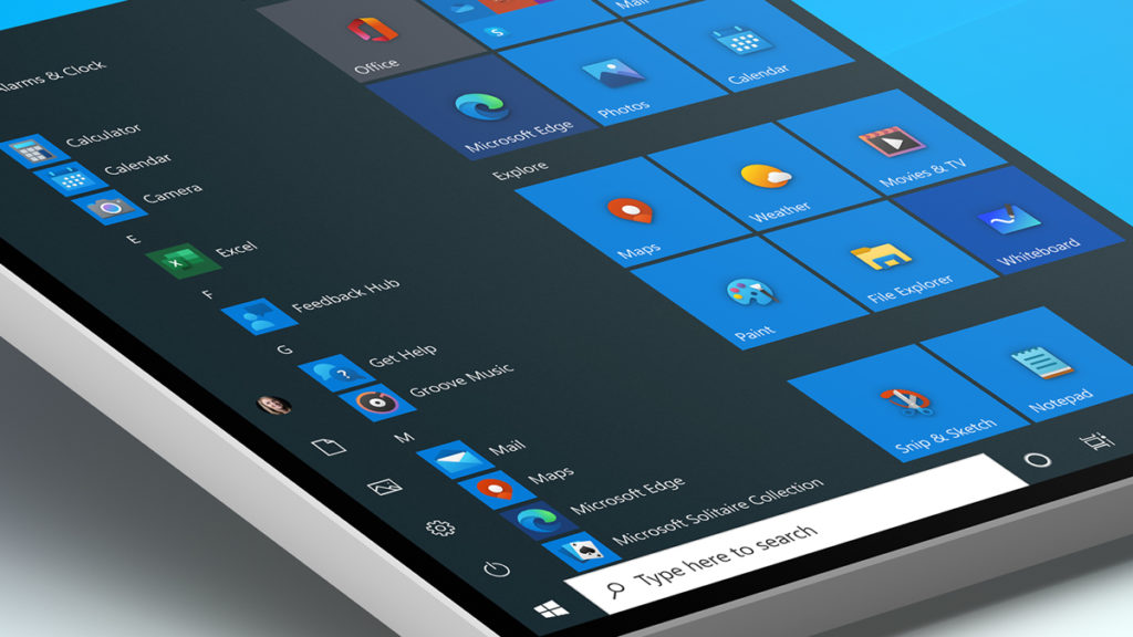
Windows 10’s User Interface Design Update Teased in New Images

Tsing

The FPS Review
Staff member
Joined
May 6, 2019
Messages
12,575
Points
113
windows-10-fluent-design-icons-tablet-1024x576.jpg
Image: Microsoft


Microsoft is reportedly planning to introduce a major visual overhaul for Windows 10’s user interface in the second half of 2021. A deleted image by a Microsoft employee, which shows a future iteration of the Windows Terminal app, seems to suggest that one of the major changes of the so-called “Sun Valley” design update will be rounded menu corners, as well as what appears to be more significant transparency effects. While Microsoft’s new Windows 10 design is likely still a work in progress, this is not the first leak that has suggested that the company intends to transition away from the operating system’s traditional, hard corners...

Continue reading...


I really should get around to buying some sort of classic shell. I only keep Windows around for games on my personal machine these days, so it hasn't been much of an issue, but if I had to use it for other things, I would want a classic shell right away.
 
When Win10 first came out, I ran Classic Shell for a while. Now I just accept that I don't really need it. I don't even use the Start Menu any longer.
Stardock (of all people) used to have some slick paid utilities that did a lot though, but I never checked them out.

Now I just run either Sidebar Diagnostics or Rainmeter, and let Windows do whatever the hell it wants past that, so long as it stays out of my way.

The most frustrating thing is the control panel shuffle - watching various settings get randomly moved back and forth between inconsistent user interfaces is maddening. That, and local File Sharing just getting broke all the time... I stopped relying on it and pretty much just use SSH/SFTP for everything now via my NAS.

One of my biggest Win10 settings / control panel frustrations is if you forget to return a statically assigned IP on a network device to DHCP before pulling the hardware from the system. The device disappears and you can no longer make changes to it, but the statically assigned IP remains in an "in use" state, so unless you reinstall the device and unassign the IP or wipe the system and install from scratch, you can never use that IP again...
 
Are we going to eventually come back full circle to aero when people realize that having depth to the UI to distinguish things is a good idea?

So sick and tired of "modern" flat interfaces.
 
I tolerate Win 10, and some of it's aesthetics is meh. I delete most of the tiles and hardly use the start menu.

My worst complaint is about the time I get the network talking to each other at home, here comes an update that borks that on at least one, or sometimes all systems. After the last round, my Plex box suddenly has to ask for permission to do anything, and refuses to map drives, or be seen by the TR box, I could care less about a user interface overhaul. Just quit breaking stuff with updates. Yet, if that's what marketing thinks they need to do, whatever. Pay raises for them I guess.

My day to day stuff happens in Linux most times, and the likelihood I ever ditch Windows completely is nil. I like the mix of OS's in my use case.
 
Become a Patron!
Back
Top