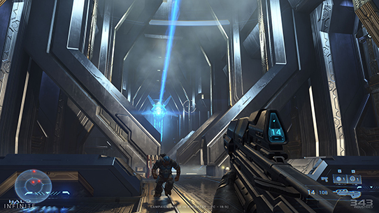
Halo Infinite Looks Great Now

Tsing

The FPS Review
Staff member
Joined
May 6, 2019
Messages
12,575
Points
113
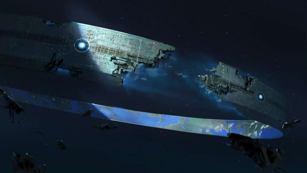
halo-infinite-pelican-ring-concept-art-1024x576.jpg
Images: 343 Industries


Halo Infinite’s campaign mode looks a lot better now than it did when 343 Industries premiered the heavily anticipated sequel’s first official campaign gameplay footage back in the summer of 2020 and disappointed long-time fans with its shoddy, Minecraft-like graphics. The visual improvement is quite evident by a series of new screenshots that the developer shared in its latest Halo Waypoint update, which shows an appreciable increase in both environmental and weapons detail. A gallery that shows off Halo Infinite’s time-of-day lighting system also appears to confirm some stunning vistas.


“Infinite’s world is incredibly large, and its vast combat zones connect...

Continue reading...


Great? naaaah, looks a lot better than what it looked before, I'll give you that.
 
I don't really remember the environments looking bad - thought it was more of an issue with the character models.

Still, can't help but feel some excitement here - looking forward to having a Halo game on PC to play.
 
Not sure I would call it great but definitely better than before. Look forward to this title. I need to play the Master Chief Collection, never played a Halo game.
 
Looks like halfway between cell shading and concept art to me. Not very realistic graphics.
 
Doesn't look much different, to me. Still looks like a 3D animated cartoon movie. Shading is definitely better, so it doesn't look as flat as the first version shown, but still not what I would expect from a flagship title for your new console.
 
Well, now it has 32:9 support as well. Here are just a few images from 343.


halo-infinite-32-9-screenshot.jpg

halo-infinite-32-9-screenshot 2.jpg

halo-infinite-32-9-screenshot 3.jpg
 
Still looks meh to me, but at least it looks better than before.
 
Become a Patron!
Back
Top