Love the new layout

Brian_B

FPS Enthusiast
Joined
May 28, 2019
Messages
7,825
Points
113
Looks great!

Any chance we can get a selector or toggle or something for font size in the articles?

There's a bunch of F'n Old Farts around these forums, and I am one of them. I use Zoom on Chrome, it makes the text readable but the pictures get gigantic.

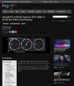
And while I'm being super nit-picky (I really do like it, honest!) - there's a ton of empty space around the sides. This is a screen grab from my monitor -- no zoom applied, no ad blocking. There is a footer ad that floats, but it's pretty thin, and another add along the bottom of the right-hand graphics for the news feed.

And all that lovely empty space on the left and right.

Now, when I zoom in so the font is something legible, that empty space is mostly gone. The graphics (like the NVidia card in the screen shot below) take up almost the entire screen by themselves then, but I can read the article.

Maybe my gripe isn't so much that the font is too small, but that it isn't scaling to 4k well?
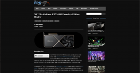
1666022147556.png
 
Last edited:
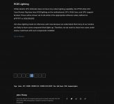
I'm running 4K at the office, and the font scaling seemed to be OK for me..

1666034522482.png
 
I like how the News Ticker is nothing more than an MSI Advertisement bar... LOL
 
Last edited:
@Brian_B Are you running any percentage scaling on your setup? I.e. on my 4k monitors (laptop) I usually run at 150%.

I can try out some testing to see... Though, my guess is the theme has a limit of number of pixels wide and will blank bar it like that regardless...

@Space_Ranger what's your scaling set to?
Ooo good thought. I am indeed - 150%
 
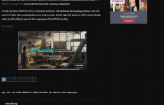
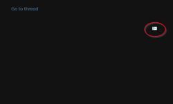
My only criticism of the new layout (and I believe it was this way with the old layout too, but now it stands out more) is the constant "Go to Thread" link on every page of the article. Also, the gaps between content are larger than usual as well (IE the Go To Thread and the page designations at the bottom).

This snippet was taken without any adblocking on (uBlock Origin off and Privacy Badger off)

1666102035220.png
 
I'm running 4K at the office, and the font scaling seemed to be OK for me..
Hmm, if I switch to 100% scaling it actually gets much worse for me. Everything just shrinks (as expected) and that makes the emptiness on the sides much larger. Here's a snippet from full screen landscape orientation (didn't go all the way down to keep the pic size smaller, so aspect ratio looks a bit off in that capture). Maybe if I were portrait it would look good?

1666109103670.png
 
My only criticism of the new layout (and I believe it was this way with the old layout too, but now it stands out more) is the constant "Go to Thread" link on every page of the article. Also, the gaps between content are larger than usual as well (IE the Go To Thread and the page designations at the bottom).

This snippet was taken without any adblocking on (uBlock Origin off and Privacy Badger off)

<snip>

1666112522838.png

The blank you're seeing is an ad slot that's being injected by the ad network. Either you've got something else blocking it from serving OR they did not get any bids to fill the slot and just rendered it as blank.

On the "go to thread" thing - that's injected by the plugin that links the articles to the forums and I'm fairly sure it does not have the ability to only place itself on the last page... Thus... probably not something that will end up getting fixed, though, I may be able to hax a bit and change it to different text....
 
Hmm, if I switch to 100% scaling it actually gets much worse for me. Everything just shrinks (as expected) and that makes the emptiness on the sides much larger. Here's a snippet from full screen landscape orientation (didn't go all the way down to keep the pic size smaller, so aspect ratio looks a bit off in that capture). Maybe if I were portrait it would look good?

View attachment 1961

I'm testing on the review rig 4k screen, and I'm seeing the max size for the layout is ~1240px. At 150% scaling, it's close to half the width of the 4k monitor before the bars join the chat. This is consistent with Edge and Chrome, have not tried with Fireferret.

What happens if you mash Ctrl + 0? Perhaps you've got some zoom out applied (which this will reverse)?
 
View attachment 1962

The blank you're seeing is an ad slot that's being injected by the ad network. Either you've got something else blocking it from serving OR they did not get any bids to fill the slot and just rendered it as blank.

On the "go to thread" thing - that's injected by the plugin that links the articles to the forums and I'm fairly sure it does not have the ability to only place itself on the last page... Thus... probably not something that will end up getting fixed, though, I may be able to hax a bit and change it to different text....
Thank you for all your hard work David!

They are indeed now serving a blank.. This is what I'm getting now:
1666114631636.png
 
Last edited:
In the linked post that follows, I mentioned a recent issue in which certain blocks of text in an article are erroneously appearing in all caps: https://forums.thefpsreview.com/thr...-at-289-and-329-respectively.10387/post-61248

The issue was confirmed by @Brian_B and @DrezKill, who observed the same effect from Chrome and Firefox, respectively, so it doesn't seem to be a browser-specific idiosyncrasy.

Please ignore this comment if you're already aware of the issue.

Thanks for bumping this here for visibility. I agree they're ugly - I just put it to normal text (not all caps), bumped the size down a couple points and italicized it. Is that looking any better?
 
I'm testing on the review rig 4k screen, and I'm seeing the max size for the layout is ~1240px. At 150% scaling, it's close to half the width of the 4k monitor before the bars join the chat. This is consistent with Edge and Chrome, have not tried with Fireferret.

What happens if you mash Ctrl + 0? Perhaps you've got some zoom out applied (which this will reverse)?
I was at 125% in Chrome. Zooming back out makes it even worse. There's more blank space than article, by a lot. This is no desktop scaling, no Chrome scaling, full screen 4k landscape orientation -- again, bottom of pic left out since it isn't entirely pertinent

1666130233139.png
 
Become a Patron!
Back
Top