Microsoft Planning Major Windows 10 UI Refresh for 2021

Tsing

The FPS Review
Staff member
Joined
May 6, 2019
Messages
12,222
Points
113
windows-10-light-logo-1024x575.jpg
Image: Microsoft


As part of its recent Windows 10 October 2020 update, Microsoft added a few visual tweaks to the Start menu to improve the look of the OS, but while those changes are a definite improvement, the company may be prepping a complete overhaul that reinvents Windows 10’s aesthetic completely.


According to Windows Central’s sources, Microsoft will be rolling out a major update in 2021 to replace many of Windows 10’s top-level interfaces, such as the Start menu, Action Center, and File Explorer. The changes will presumably include a sleeker, modernized skin, as well as refined menus and new...

Continue reading...
 
" The changes will presumably include a sleeker, modernized skin, as well as refined menus and new animations. "

Oh yay, I just can't wait for another update that moves old things around or deletes them and makes it all the more confusing to find menus and settings.
 
I just hope they pull another Windows 8 on us so I won't even know how to turn my PC off ... moar bigguh tiles!!
Try doing a remote desktop to Server 2016 (retains the full-screen menu) on another continent, and from that server, to one on a third...

We're talking dial-up speeds with worse latency here, and you're waiting for that stupid screen to load :D

Oh yay, I just can't wait for another update that moves old things around or deletes them and makes it all the more confusing to find menus and settings.
The migration of stuff to the Settings app has been a little annoying, partly because you sometimes just have to look up where a particular setting went, and partly because they didn't just do it all at once -- so if you run the dark theme like a normal human, your regularly get blasted with bright white 'classic' apps.
 
Try doing a remote desktop to Server 2016 (retains the full-screen menu) on another continent, and from that server, to one on a third...

We're talking dial-up speeds with worse latency here, and you're waiting for that stupid screen to load :D


The migration of stuff to the Settings app has been a little annoying, partly because you sometimes just have to look up where a particular setting went, and partly because they didn't just do it all at once -- so if you run the dark theme like a normal human, your regularly get blasted with bright white 'classic' apps.
With the settings app abomination they are trying to get people to use search. Even worse, Windows is now constantly nagging about using your voice to do things if you don't know how to turn that off, especially when you have a microphone plugged in. Who needs convenience when you could be wasting time yelling at your computer.
 
What's it gonna cost? I suppose it's subscription based UI themes? They have a Christmas one?
 
I dread every forced w10 update. Something always ends up missing after them, some feature "streamlined" some user choice curtailed. Maybe the online account requirement nags you every time not just once. It's all downhill I say.
 
While Windows 10 isn’t the worst-looking operating system, a visual uplift is certainly welcome in light of its countless legacy apps, whose designs and icons have become clearly outdated.
Yes, because that's exactly what we need an even more "lightweight" and mobile optimized UI for a desktop OS. Makes sense (windows 8 banging on the door intensifies)

Every new ui element and app in w10 is touch optimized. WTF would you do that on a DESKTOP OS?
 
Oh for ****s sake.

I'm only just starting to get used to the current interface, and wish I had the old one, and they are going to change it again?

Dont get me wrong. I'm all in favor of IMPROVEMENTS, but most of the time these style updates seem just arbitrary and annoying.
 
Every new ui element and app in w10 is touch optimized. WTF would you do that on a DESKTOP OS?

Sadly, that's the way everything is going. Desktop is an afterthought these days. There is some idiot trainer in UI school somewhere is teaching people to make all the font sizes HUGE, (nothing should ever be above 10pt IMHO), with HUGE buttons with dead space so people can fat finger them on a stupid touch interface.

More and more I feel the need to view webpages at 80% or its just too large and picturebook looking.

We are not toddlers. Stop giving us toddler interfaces!

The denser the information, the better! The less empty dead space the better! There is no reason a button should ever be bigger than 2x ti 3x the mouse pointer.

Why does everything always have to be designed for the lowest common denominator? I wish we could just remove all non-tech enthusiasts from ever using any tech, and be done with it.
 
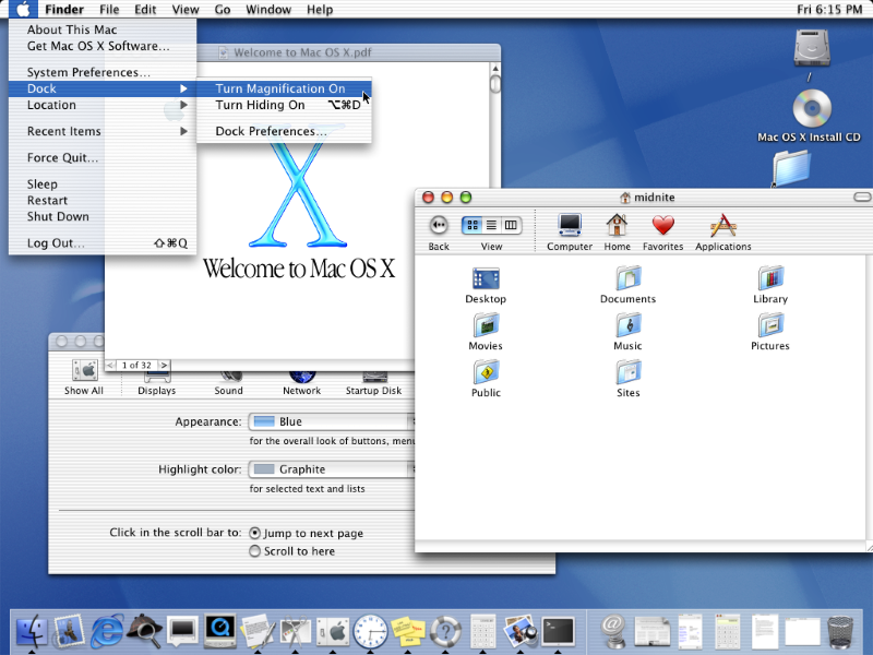
For all the crap that Apple gets... OS X has been around for almost 20 years now, and if you went all the way back to the beginning in 2001 and then looked at the latest (Big Sur) set to come out later this year:

It's evolved a bit, but pretty much the same. If you knew how to use one and where to find everything, you still can even 16 major revisions later.


MacOSX10-0screenshot.png


screen-shot-2020-06-22-at-2-11-39-pm.png
 
For all the crap that Apple gets... OS X has been around for almost 20 years now, and if you went all the way back to the beginning in 2001 and then looked at the latest (Big Sur) set to come out later this year:

It's evolved a bit, but pretty much the same. If you knew how to use one and where to find everything, you still can even 16 major revisions later.
I've never seen apple get crap for their UI. What they get it for is well earned.
 
I hate those new flat config screens so much. I hate them with a passion.
It's not even just the look. But half of the functionality is carried over to the new settings app, while the rest remains in the old control panel. So what you could do within one dialog panel previously now you need to look for in two completely separate places.
 
Well maybe Task Manager will finally ****ing reflect Dark Mode now.
 
This is why I put some entries in my router to block Microsoft's update. I wait to see how bad everything is before allowing updates to happen on my network now. My life has been much more pleasant.
 
This is why I put some entries in my router to block Microsoft's update. I wait to see how bad everything is before allowing updates to happen on my network now. My life has been much more pleasant.

I usually just bite the bullet on these things. I want to make sure I get all of the security patches. That is a far higher priority than having to put up with UI or other changes I don't like.
 
Become a Patron!
Back
Top