Microsoft Teases New Windows 10 Start Menu Design with Revamped Icons, and It Looks Pretty Great

Tsing

The FPS Review
Staff member
Joined
May 6, 2019
Messages
11,232
Points
83
windows-10-fluent-design-icons-monitor-1024x576.jpg
Image: Microsoft


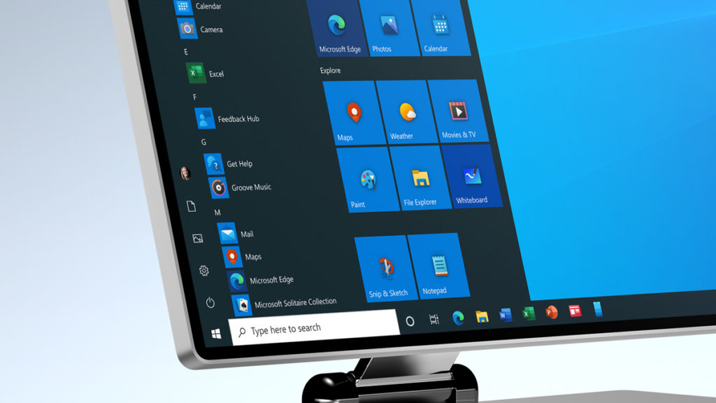
Microsoft’s design team has shared an early peek at what Windows 10’s Start Menu will look like in the near future, and it looks like a definite improvement over the current version. Gone are the monochrome tiles and tedious icons, which have been replaced by modern, colorful versions with a better sense of depth. The background color of the tiles have also been changed to line up with the user’s chosen scheme of light or dark.


Created by the @Windows design team, this animated clip illustrates a sliver of the #UX evolution and modernization of the Windows experience. Let us know what you think in the comments below...

Continue reading...


Icons are such small insignificant things yet like nails or screws things would fall apart without them.

I remember when System 7 came out when I was on my Mac FX (wish I still had it) everyone who saw it oohed and awed at how pretty the icons were. Even my Apple hating roomie of the time.

I suspect I am too old and cynical to ooh or awe these days still it's nice to see some improvements. :)
 
WOW! Something finally to be excited about!
Wait, no. The opposite of that.
 
Become a Patron!
Back
Top