MSI MEG CORELIQUID S360 AIO Cooler Review

David_Schroth

Administrator
Staff member
Joined
Apr 23, 2019
Messages
1,210
Points
113
msi_megs360_banner.png


Introduction


MSI has been a staple in the PC component industry for as long as all of us can remember and over the course of the years, has been branching out from its motherboard roots into a full stack of products. We have looked at a number of their video cards, motherboards, SSDs, and power supplies, but today, we’ll take their new AIO cooler (liquid cooler) out for a spin to see if it continues their reputation for providing good products to gamers and creators.


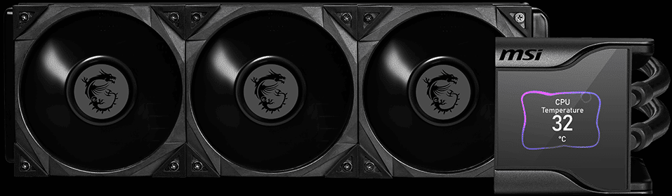
MSI sent us its MEG CORELIQUID S360 that is part of the...

Continue reading...
 
Last edited by a moderator:
Please use better colors for your summary graphs. I'm not color blind and can barely tell them apart.
 
Please use better colors for your summary graphs. I'm not color blind and can barely tell them apart.
Hmm.

I vote for the current color scheme - what is being reviewed is "highlighted" and everything else is the same, with big bars and plenty of spacing between them. Makes it easy to pick out what is new.

I look at something like this, and my eyes go cross-eyed.. and this is better than some.

119237_575px.png


or this, which is not good either, in my opinion

1634670277761.png
 
Oh no, that's a terrible graph too. I'm specifically just talking about the summary graphs at the end (page 6) with the shades of blue. The larger graphs throughout the article are fine.
 
Oh this one? Yeah, I agree, this is ... much less pretty than the graphs in the preceding sections. The numbers even overlap on other bars, and it's all one color, just barely different shades. I can't tell from the legend what is what (I ~am~ colorblind fwiw)

1634682398842.png
 
Please use better colors for your summary graphs. I'm not color blind and can barely tell them apart.

Lemme see if I can hex edit in some better colors. At least you can mouse over the bars on that chart.... This plugin is a bit of a pain to customize...

Though, would you say that the colors should all be different in that scenario, or should they just be all the same?
 
Lemme see if I can hex edit in some better colors. At least you can mouse over the bars on that chart.... This plugin is a bit of a pain to customize...

Though, would you say that the colors should all be different in that scenario, or should they just be all the same?
I think - more space between the bars to start with. You can see the temps at the ends are overlapping on the bars adjacent.

Apart from that - I think there just needs more separation between the colors. I can't tell the difference between 100, 1500rpm and Max Fan. I mean, I can tell they are slightly different shades, but looking at the bars (other than I can guess), I couldn't tell you which was which. I don't think the fact that they are all blue is necessarily bad, it's just, they are all some middling shade, you'd need really light through really dark if you wanted to stick with the same color. That, or limit your options down to just 2 or 3.

I can see there are 5 things in the legend, but I only see 4 bars on most of them, so yeah, I can't really tell what's what there. I can see some bars are darker than others, but I can't tell what it aligns to in the legend.
 
Become a Patron!
Back
Top