- Joined
- May 6, 2019
- Messages
- 11,391
- Points
- 83
Image: Discord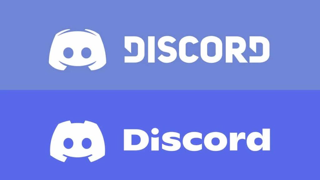
Discord was updated with a new logo last week to celebrate the popular chat client’s sixth birthday. Unfortunately, the designers appear to have made a big mistake on the new font selection, as it has received quite a bit of ridicule since its unveiling on Thursday. Discord’s mascot, Clyde, has also received a few changes, but they’re subtle enough to not have triggered any long-time users.
Image: Discord
Challenge to all commenters: pick a better font. pic.twitter.com/14K7b1oY5B— 🅁ob 🄿layin' 🄶ames (@RobPlayinGames) May 13, 2021
Apparently it’s a tweaked version of the font Ginto, which isn’t really important because it...
Continue reading...