You are using an out of date browser. It may not display this or other websites correctly.
You should upgrade or use an alternative browser.
You should upgrade or use an alternative browser.
Summary captions only show ToC
- Thread starter Brian_B
- Start date
- Joined
- Apr 23, 2019
- Messages
- 1,455
- Reaction score
- 2,045
What page is that one on? I can't find it.
I updated that bleeping plugin a few days ago because it was crashing the server by asking for 250mb of memory....
I updated that bleeping plugin a few days ago because it was crashing the server by asking for 250mb of memory....
Brian_B
Forum Posting Supreme
- Joined
- May 28, 2019
- Messages
- 8,541
- Reaction score
- 7,241
AMD Offers New Bundles

 www.thefpsreview.com
Does same thing on Chrome for Windows as well.

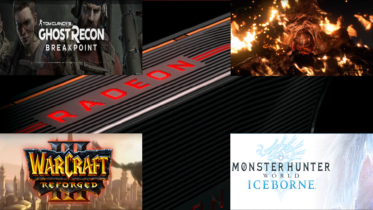
AMD Offers New Bundles for Some RX Series Cards
Game bundles can offer great incentives for potential hardware purchases. AMD recently updated bundles for its latest RX line. These new offerings begin on February 4th and will end on April 25th.
Does same thing on Chrome for Windows as well.
- Joined
- Apr 23, 2019
- Messages
- 1,455
- Reaction score
- 2,045
AMD Offers New Bundles

AMD Offers New Bundles for Some RX Series Cards
Game bundles can offer great incentives for potential hardware purchases. AMD recently updated bundles for its latest RX line. These new offerings begin on February 4th and will end on April 25th.www.thefpsreview.com
Does same thing on Chrome for Windows as well.
Ah. Got it. That I suspect would be Google misbehaving. Google is supposed to be auto inserting ads only to the mobile view and they are not supposed to be serving the other articles from the site, but it seems they are. Something is very screwy with that number of insertions happening regardless. I'll see what I can do!
- Joined
- Apr 23, 2019
- Messages
- 1,455
- Reaction score
- 2,045
Hmm looks like to where you were trying to cross link to your own reviews of those products
You're right. I don't know what $_$@@$@#$*** thing is doing that. I know that's not a plug-in I installed. #$#@$$@*@$@@@!!
Brian_B
Forum Posting Supreme
- Joined
- May 28, 2019
- Messages
- 8,541
- Reaction score
- 7,241
My guess would be the ToC element is near the top of the content, and whatever addon/plugin in skimming your article to create the preview is picking up the ToC since it's at the top of the content.
It should be ignoring it, but not sure how you can set that up. Might run a quick test and just move the ToC to near the bottom, or outside of the element that contains the content, and see if it continues. May not fix it, but may shed some light on how to get there.
It should be ignoring it, but not sure how you can set that up. Might run a quick test and just move the ToC to near the bottom, or outside of the element that contains the content, and see if it continues. May not fix it, but may shed some light on how to get there.
- Joined
- Apr 23, 2019
- Messages
- 1,455
- Reaction score
- 2,045
My guess would be the ToC element is near the top of the content, and whatever addon/plugin in skimming your article to create the preview is picking up the ToC since it's at the top of the content.
It should be ignoring it, but not sure how you can set that up. Might run a quick test and just move the ToC to near the bottom, or outside of the element that contains the content, and see if it continues. May not fix it, but may shed some light on how to get there.
The thing is though, the skimming shouldn't be happening in those positioning, it should only be displaying links. It's probably some WordPress "feature" we weren't aware of. I'll be home soon to look at it more.
But for that specific article, adding those summary boxes in to the mobile view completely destroys the flow of the article.
- Joined
- Apr 23, 2019
- Messages
- 1,455
- Reaction score
- 2,045
Ok, this should be resolved. Root cause - Peter pasted the the internal link into a blank block, Wordpress assumed he wanted a "Wordpress" block instead of a text/quote block and created that widget looking thing (which is smart enough to render the table of contents menu into its text). Solution for the future: we'll create the text first, then add the link, so wordpress doesn't get confused.
With respect to moving the ToC - that will become a PITA - we have 2 options for it to automatically get placed - 1. Top of article and 2. Floating along side the text (it's a dysfunctional dumpster fire this way). If we don't do those, then we have to manually place the ToC everywhere we want it to appear in the article, which will lead to a rather inconsistent remembering to do so....
With respect to moving the ToC - that will become a PITA - we have 2 options for it to automatically get placed - 1. Top of article and 2. Floating along side the text (it's a dysfunctional dumpster fire this way). If we don't do those, then we have to manually place the ToC everywhere we want it to appear in the article, which will lead to a rather inconsistent remembering to do so....

