Image: Microsoft
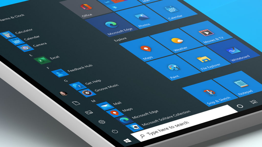
Windows 10 isn’t the worst-looking operating system out there, but certain aspects of its user interface are in dire need of an overhaul. These would include archaic icons, many of which date back decades and have become major eye sores – but changes are finally afoot.
Microsoft has begun rolling out the first of its Fluent Design icons to Windows Insiders in the Fast ring, adding a colorful element to built-in apps such as Alarms & Clock, Calculator, Mail, and Calendar. Many of them seem inspired by Android’s Material Design language, but they’re a definite upgrade from the “flat, monochrome” icons that were previously employed...
Continue reading...
