Yikes, What happened to the Front Page?

Zarathustra

Cloudless
Joined
Jun 19, 2019
Messages
4,133
Points
113
The old layout was clean and easy to navigate.

Just seeing a new layout today, and wow is it busy and muddled, with clunky large menu elements that waste screen real estate. Quite frankly it is a HUGE downgrade, and makes the site look like a mobile page, even on a desktop.

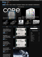
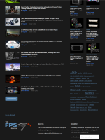
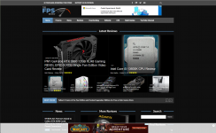
Old Design:

Page 1:

1666108477298.png1666108528273.png


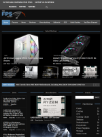
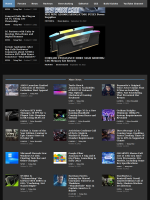
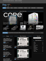
New Design:

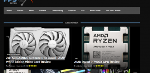
1666108666805.png1666108761782.png

Is this intended to be the final layout, or is it something that is still being tinkered with?

I find the new layout is much more difficult to follow and effectively use.
 
Last edited:
Tinkering can still be done - we needed to move off the old theme due to it not having the ability to add features that I'm working on and it being more or less unsupportable (I'm not a coder, yet.. the custom code was unreal... a basic update would have exploded the whole thing).

For that very top menu, that's a window width thing that I may be able to handle more elegantly - hold my beer on that, but I can probably put in a width limiter and hide a portion of that menu below a certain window size.

Can you be more specific related to the menu elements that aren't helpful beyond that very top one? Should the main menu not float down with your scroll?

A quick explainer on the logic for how I laid it out (which, is very easy to change) ->

Front Page
First section, most recent 7 reviews.

Second section, left column -> most recent 7 news postings.
Second section, middle column -> 8th to 10th most recent reviews
Section section, right column -> A way for a user to quickly get to review content they may want via a search box and categories. Also room for an ad slot that doesn't seem to have checked in on your browser 👀

Third section - 8th - 20th most recent news posting, infinite load a few times before quitting.

From prior front page feedback I've received, one of the important things for users was to be able to quickly scroll and see what they have/have not read yet, hence the 7 items in that left column (as that's about a day's worth of content right there) with the rest rounding out the bottom of the page.

Now, the other thing to consider is the revamp on the Category pages (i.e. News, Reviews, etc.). That's currently laid out as follows:

Category Page
Left Column -> Dynamic menu to display sub-categories of the category you're on.

Right column, First Section -> 5 most recent items from that category.
Right column, Second Section -> 6 - something items from that category with pagination to reach more.
 
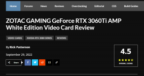
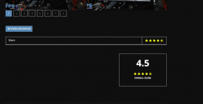
I should probably also add some of the upcoming features, one of which will debut with Thursday's review, which will be review scoring and a whole stars mechanism (screenshots from the test environment).

1666113844381.png

1666113864390.png
1666113884866.png
 
Tinkering can still be done - we needed to move off the old theme due to it not having the ability to add features that I'm working on and it being more or less unsupportable (I'm not a coder, yet.. the custom code was unreal... a basic update would have exploded the whole thing).

For that very top menu, that's a window width thing that I may be able to handle more elegantly - hold my beer on that, but I can probably put in a width limiter and hide a portion of that menu below a certain window size.

Can you be more specific related to the menu elements that aren't helpful beyond that very top one? Should the main menu not float down with your scroll?

A quick explainer on the logic for how I laid it out (which, is very easy to change) ->

Front Page
First section, most recent 7 reviews.

Second section, left column -> most recent 7 news postings.
Second section, middle column -> 8th to 10th most recent reviews
Section section, right column -> A way for a user to quickly get to review content they may want via a search box and categories. Also room for an ad slot that doesn't seem to have checked in on your browser 👀

Third section - 8th - 20th most recent news posting, infinite load a few times before quitting.

From prior front page feedback I've received, one of the important things for users was to be able to quickly scroll and see what they have/have not read yet, hence the 7 items in that left column (as that's about a day's worth of content right there) with the rest rounding out the bottom of the page.

Now, the other thing to consider is the revamp on the Category pages (i.e. News, Reviews, etc.). That's currently laid out as follows:

Category Page
Left Column -> Dynamic menu to display sub-categories of the category you're on.

Right column, First Section -> 5 most recent items from that category.
Right column, Second Section -> 6 - something items from that category with pagination to reach more.

I don't mean to try to enforce my opinions on your site and other readers, but a few things stood out to me, so I figured I'd mention it to try to be helpful.

First, before my list. The mobile version on my phone looks really sharp and is clear and easy to follow. I'm not sure I would mess with that, but I feel the desktop version might needs some massaging as follows:

1.) The top overlap was notable, but you have already spoken to that.

2.) The big flat grey bars surrounding the menus just seem excessive and take up a **** ton of screen real estate. Are they really necessary, or can they be shrunk down significantly? I know it's all the rage to have large fat finger touch screen elements on web pages these days, but do we really need to see those on desktop browsers?

3.) This last one is really tough to put my finger on, but my eyes are just having trouble following the rest of the content in the layout. It feels busier, and more difficult to follow. Maybe it's because each articles headline text is really bold and white, and the section headings are darker and thus don't stand out. Not sure. If those were reversed such that the section headings like "news" "reviews" and "search" were bolder and stood out more, and the individual article links you need to click on were the ones that were slightly less contrasty maybe it would flow better on the eyes.

At first I thought it was a spacing thing, with more black space between sections in the old design giving different sections a more separation and making them easier to follow, but zooming out and comparing them side by side that does not appear to be the issue, as the spacing isn't very different. (Well, maybe slightly, but not a ton) I'm not sure though.

The old design just felt clean, easy on the eyes, and easy to follow logically. The new design just comes across as very busy and more difficult to follow what the hell is going on.

4.) I'm also not a fan of the infinity scroll on the bottom. Firstly I don't like infinity scrolls at all (but that's a personal preference, so please disregard) but also, lists are always easier to follow than icon/square boxes. They always confuse the eyes as to which direction they are supposed to scroll down. A single column list of news stories would likely be easier to follow.

I'm not a UI expert, but my takeway has always been, whenever possible:

Always do this: 1666116322337.png

Never do this: 1666116339857.png

Don't get me wrong. Multiple columns with separate headings, you can just scroll down with your eyes aren't a problem, but when the same content is in one section as tiles, multiple columns wide it just become distracting and weird to follow.

In general I wish the whole concept of tiles would just die in a fire. It's just not a good way to structure information.

5.) The menu following me down the page doesn't really bother me at all. In fact, it's quite convenient.

I hope these remarks are helpful in some way!
 
Last edited:
I edited the previous post a few times, as I thought of new things I wanted to add, but I decided maybe that was not a good idea, as content may get missed. I'll start this one in a new post:

News section:

1666116857869.png

1.) On this page it is unclear to me what is different about those top few stories above the divider and the ones below the divider. it just adds some confusion.

Are they just the most recent stories? Are the highlighted for some reason? I don't know?

2.) I like the bottom half below the bar. It's nice and easy to scroll them sequentially and make sure you've seen them all. I would add a little bit more spacing between the images and the headlines though, as it feels very tight. The text is like, right on top of the image, and its a bit distracting.

3.) There are also some weird black gaps if you scroll down. I'm not sure if that is intended as ad space, but right now it's just black and odd.
 
Last edited:
Also room for an ad slot that doesn't seem to have checked in on your browser 👀

Side note:

I just noticed I had forgotten to sign up on Patreon. (I thought I had done this years ago when I signed up)

I do use ad blockers (but I checked with it off to make sure it wasn't breaking anything), but I like to make up for it by joining Patreon and the like for sites I appreciate (and this is certainly one of them).

I can't imagine ad revenues from my visits would amount to more than $5 per month (if I saw them) so that's the number I went with. (if I got this guesstimate way off, which is very possible since I have no frame of reference, please feel free to correct me)

In fact, I can't imagine advertisers doing anything but lose money off of serving me ads, as I never click on ads no matter what, and form negative views of advertisers when I see their ads, for disrupting my enjoyment of the web :p

Anyway, I've rectified that now. If I'm going to be making suggestions on layout, I should at least be chipping in a little :p
 
Last edited:
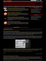
As an example of a fantastic layout, we always have the classic...

1666118025356.png 1666118078846.png

Things it has going for it:

1.) Throughout, text is nice, small and readable

2.) Menu elements are also small, and don't take up a **** ton of screen real estate.

3.) Important recent updates/reviews are up top, which also has a side bar for relevant content

4.) Below that is the news section, which is single column. There is lots of detail, you can absorb it without clicking to a separate page. You can scroll from top to bottom, and always come back later and easily find where you left off, so you know you haven't missed any of the news stories.

5.) There are no tiles. Tiles are evil.

It's simple, it's clear, it's concise, it is easy to navigate, and everything isn't huge and in your face, like you are sitting too close to a large TV.

If I can find any fault with this layout it is that the image format, just centered in the middle of the article is a little bit boring.. That could have been done better.

One could even extend a sidebar down into the news section in this layout to allow more space for announcements or important information, or maybe even an ad or two.
 
Last edited:
For reference, my starting point was this theme template - https://demo.tagdiv.com/newspaper_news_hub_pro/. We're running on the Newspaper theme, so you can also look at a ton of sample sites here - https://tagdiv.com/newspaper-showcase/

2.) The big flat grey bars surrounding the menus just seem excessive and take up a **** ton of screen real estate. Are they really necessary, or can they be shrunk down significantly? I know it's all the rage to have large fat finger touch screen elements on web pages these days, but do we really need to see those on desktop browsers?

I cut down the main menu by about 25%. Font has changed, but that'll probably change again.

3.) This last one is really tough to put my finger on, but my eyes are just having trouble following the rest of the content in the layout. It feels busier, and more difficult to follow. Maybe it's because each articles headline text is really bold and white, and the section headings are darker and thus don't stand out. Not sure. If those were reversed such that the section headings like "news" "reviews" and "search" were bolder and stood out more, and the individual article links you need to click on were the ones that were slightly less contrasty maybe it would flow better on the eyes.

So, I can make the section headers larger and add some more contract - working with a dark theme like this actually paints us into more of a corner for color selection. I ended up making all the white text white (i.e. #ffffff) as opposed to something a bit darker (#eeeeee) that's still acceptable on a black background, but it kind of starts to get lost.

Fontwise, Brent isn't liking that, so we'll probably change fonts some as well.

Update - Apparently the section headers were a grey shade instead of solid white. Moved it to solid white and boosted font from 17 to 25. Also threw a background box around the category tags across the board on the front npage.

4.) I'm also not a fan of the infinity scroll on the bottom. Firstly I don't like infinity scrolls at all (but that's a personal preference, so please disregard) but also, lists are always easier to follow than icon/square boxes. They always confuse the eyes as to which direction they are supposed to scroll down. A single column list of news stories would likely be easier to follow.

I'm not a UI expert, but my takeway has always been, whenever possible:

Always do this:
1666116322337.png


Never do this:
1666116339857.png

I'm not a huge fan of it either -> I can replace with a load more button, but end of the day, I also don't expect a lot of users to actually hit that infinite load trigger.

Don't get me wrong. Multiple columns with separate headings, you can just scroll down with your eyes aren't a problem, but when the same content is in one section as tiles, multiple columns wide it just become distracting and weird to follow.

I tinkered with that bottom tile thing a bit, and there really wasn't a much better option for filling stuff in that I could find.. though.. if you see any blocks in those samples, I could be convinced to change it...

2.) I like the bottom half below the bar. It's nice and easy to scroll them sequentially and make sure you've seen them all. I would add a little bit more spacing between the images and the headlines though, as it feels very tight. The text is like, right on top of the image, and its a bit distracting.

Added 30px in between.

3.) There are also some weird black gaps if you scroll down. I'm not sure if that is intended as ad space, but right now it's just black and odd.

Those are ad insertions.

I just noticed I had forgotten to sign up on Patreon. (I thought I had done this years ago when I signed up)

Thanks!

I can't imagine ad revenues from my visits would amount to more than $5 per month (if I saw them) so that's the number I went with. (if I got this guesstimate way off, which is very possible since I have no frame of reference, please feel free to correct me)

You'd have to load about 500 pages per month during most times of the year.... (though, time on page certainly impacts revenue, as well as returning vs not...)

Things it has going for it:

1.) Throughout, text is nice, small and readable

2.) Menu elements are also small, and don't take up a **** ton of screen real estate.

3.) Important recent updates/reviews are up top, which also has a side bar for relevant content

4.) Below that is the news section, which is single column. There is lots of detail, you can absorb it without clicking to a separate page. You can scroll from top to bottom, and always come back later and easily find where you left off, so you know you haven't missed any of the news stories.

5.) There are no tiles. Tiles are evil.

It's simple, it's clear, it's concise, it is easy to navigate, and everything isn't huge and in your face, like you are sitting too close to a large TV.

If I can find any fault with this layout it is that the image format, just centered in the middle of the article is a little bit boring.. That could have been done better.

One could even extend a sidebar down into the news section in this layout to allow more space for announcements or important information, or maybe even an ad or two.
The advertising models are also significantly different, and the home page has the lightest ad load out of any page that we have (and is the most visited) - it makes half per page view compared to our typical content, so quite frankly, I want you as the user to read each and every news article as an individual page load :). (though, I have looked at infinite scroll for news articles, it's just.. difficult to differentiate between those and reviews).

I also looked at adding excerpts, but it gets far too busy with those and I'd add a forum post widget, but quite frankly, it would echo the news ticker/listing as that's all the forum usage we get...
 
For reference, my starting point was this theme template - https://demo.tagdiv.com/newspaper_news_hub_pro/. We're running on the Newspaper theme, so you can also look at a ton of sample sites here - https://tagdiv.com/newspaper-showcase/


I cut down the main menu by about 25%. Font has changed, but that'll probably change again.


So, I can make the section headers larger and add some more contract - working with a dark theme like this actually paints us into more of a corner for color selection. I ended up making all the white text white (i.e. #ffffff) as opposed to something a bit darker (#eeeeee) that's still acceptable on a black background, but it kind of starts to get lost.

Fontwise, Brent isn't liking that, so we'll probably change fonts some as well.

Update - Apparently the section headers were a grey shade instead of solid white. Moved it to solid white and boosted font from 17 to 25. Also threw a background box around the category tags across the board on the front npage.


I'm not a huge fan of it either -> I can replace with a load more button, but end of the day, I also don't expect a lot of users to actually hit that infinite load trigger.


I tinkered with that bottom tile thing a bit, and there really wasn't a much better option for filling stuff in that I could find.. though.. if you see any blocks in those samples, I could be convinced to change it...


Added 30px in between.


Those are ad insertions.


Thanks!


You'd have to load about 500 pages per month during most times of the year.... (though, time on page certainly impacts revenue, as well as returning vs not...)


The advertising models are also significantly different, and the home page has the lightest ad load out of any page that we have (and is the most visited) - it makes half per page view compared to our typical content, so quite frankly, I want you as the user to read each and every news article as an individual page load :). (though, I have looked at infinite scroll for news articles, it's just.. difficult to differentiate between those and reviews).

I also looked at adding excerpts, but it gets far too busy with those and I'd add a forum post widget, but quite frankly, it would echo the news ticker/listing as that's all the forum usage we get...


I appreciate you being open to feedback! I also know I am just one reader out of many and tastes differ. That, and I am aware of competing design requirements between usability and ad revenue, so I don't expect to get everything my way, but any little way I can contribute, I am happy to :p
 
In regards to the page feeling busy, I can understand that. I think one thing may be because the title text and other text is now overlaying the tiles at the top, rather than underneath. Having the text overlay the thumbnails looks kind of messy, especially on the smaller tiles where it takes up half the height of the thumbnail itself. The second thing may be down at the more news section, I think square tiles is throwing the look off, maybe they should be 16:9 and not square for the preview image. Maybe the image should be above, with the text below, instead of to the side.
 
In regards to the page feeling busy, I can understand that. I think one thing may be because the title text and other text is now overlaying the tiles at the top, rather than underneath. Having the text overlay the thumbnails looks kind of messy, especially on the smaller tiles where it takes up half the height of the thumbnail itself. The second thing may be down at the more news section, I think square tiles is throwing the look off, maybe they should be 16:9 and not square for the preview image. Maybe the image should be above, with the text below, instead of to the side.

If you want to "focus group" some design options, I'd be happy to provide my opinions.

(Who am I kidding. I provide my opinions asked for or not :p )

I still don't understand the need for the big fat grey bar, but that might just be a "me thing."

What if the search button were moved up and to the right, thinning up that top bar which is a colossal waste of screen real estate.

Then the rest of the menu bar could be narrowed a bit.

Something like this:

Original left, my proposal right:
1666295289946.png1666296285141.png

Click to "embiggen".

This is a rough and quick Photoshop (well, Gimp ) job, so bear with me on alignment and such.

What I've done here:

1.) Shrunk top grey bar, and condensed to one line, moving search icon and social media links in line on the right right

2.) Narrowed menu bar thickness a little. (why does it have to be so fat?)

The two above also serve to make it easier for your eyes to get to the meat of the page, and not get stuck on these big gaps/barriers up top.

3.) Kept "latest reviews" section as is

4.) Got rid of "news ticker". Don't really know what purpose it serves, when all the latest news posts are right below it on the left. This cleans it up and makes the page feel less cluttered. It also drives less of a wedge between the "Latest Reviews" section, and the three columns below, allowing your eyes to get there more easily.

5.) Removed the 1px wide box line around the news stories. It was the right thing to do to test and see what it looked like, but I don't think it is helping.

6.) Added a 1px thick line of the same color as the lines I removed between the "News" column, "More Reviews" column and Search/Find Reviews column for a little bit of separation. I feel this helps guide the eyes into realizing that "hey dummy, the things here belong together".

7.) Ever so slightly darkened the headings in the news section to a smidge darker grey shade so they distract less from the section headings. (best I could, as antialiased fonts are a bitch to deal with in gimp)

What I didn't do, but thought about:

8.) Why is a search icon necessary both at the top and as a search box below where the three columns
are?

9.) Maybe the whole "Search" and "Find Reviews" column can be moved down a bit, and that space can be used for an ad insert, if there is an ad size/format that fits in that space/aspect ratio?

10.) I only marked up the first page without scrolling down, but what if the list of "more news" on the bottom were the wide column view that you get on the bottom half of the page if you click the "news" link? I think that would make it more usable than the infinity scroll tiles. Every time I get down there I think "ooh I can sign up for emails", and then it keeps moving down the page as more tiles load :p It's like Lucy is there yanking away the football just as I get to it :p

Just some food for thought. The difference is subtle, but I think this makes it slightly cleaner, and ever so slightly less busy looking and easier to follow to the eyes.

I don't know how much of this is actually possible within the confines of the API you are using, but I through it was fun to play with.
 
Last edited:
Not sure what changed, but some of the menu buttons don't work on the main page for me in Firefox now.

Home, Forum, Editorial and CES light up when I hover my mouse over them, and function when I click them. The rest do not.

Interestingly, this only happens on the main page.

If I first click one of the links that work (lets say, Editorial, and go to that page, then the links up top to everything now work, and I can click on news, but if I do it directly from the top level page, these do not work.

I tried it with all plugins disabled, and confirmed that it has nothing to do with plugins. Firefox version is 106.0.1 (64-bit) in Linux.
 
Looking at it from Chrome, it almost seems like the menu load is getting deferred. Probably some optimization I can shake my fist at.

What it seems like is happening is that any drop down menus are loading deferred (that are category driven), whereas the Forum, Editorial, CES, etc aren't category driven, but rather menu link driven. Though, after the rest of the page paints (on the home page) and the spinny mouse cursor stops, the category driven works... Lemme see what I can do...
 
Seems to work perfectly now!

Woots!

Interestingly enough, it was a performance optimization plugin that was deferring js files.. yet.. I excluded the theme files and JQuery from being deferred, but that caused the menu option... perhaps the theme needed a different js file to run before it and that put them out of order. Thanks for pointing that one out!

Now, back to your double top bar thing.. I can't seem to replicate.. but I also don't have FireFox...
 
Now, back to your double top bar thing.. I can't seem to replicate.. but I also don't have FireFox...

I'm not seeing the double top bar anymore. It disappeared a few days ago. I assumed you had changed it.

Didn't realize that was something you were having trouble reproducing, and were still working on. I would have mentioned it sooner.

Looks like this now:

1666849523548.png

Bars still seem thicker than necessary, but maybe that's just a personal peeve of mine.

I can't expect you to design your site around my preferences :p
 
I'm not seeing the double top bar anymore. It disappeared a few days ago. I assumed you had changed it.

Didn't realize that was something you were having trouble reproducing, and were still working on. I would have mentioned it sooner.

Looks like this now:

View attachment 1991

Bars still seem thicker than necessary, but maybe that's just a personal peeve of mine.

I can't expect you to design your site around my preferences :p
Well, if the social icons aren't appearing in the top bar, then it must mean your window size isn't the full width of the page, as that does look thicker than I thought I had it set.

So... The question would be, what window width are you giving it? And does the bar get thinner if you stretch your browser out to say, 1200px?
 
Here is what I look like with Google Chrome... and the bars do seem thick now that it was brought up.

1666878096149.png
 
Become a Patron!
Back
Top